The aviation industry traces its roots back to the early 1920s—shortly after the conclusion of World War I. Not surprisingly, the aviation insurance industry developed at about the same time. After all, powered flight (and the technology behind it) was still in its infancy, so the associated risks were high.
The company that is now called Global Aerospace was formed to provide financial protection to the innovators pushing the boundaries of aviation. In fact, it’s no exaggeration to say that Global was instrumental in advancing the industry. The availability of aviation insurance gave companies the confidence to forge ahead into uncharted territory.
Since its founding, Global has remained a leader in its field. But as the company approached its 100th anniversary, leadership identified the milestone as the perfect time for a comprehensive refresh of its brand, website, etc. Having collaborated with The Creative Alliance for many years, they tapped the agency to lead the way on this important initiative.
It All Starts With Strategy
In the same way that aircraft should never get airborne without a flight plan, companies should never dive into a rebranding effort without a solid strategy. Nobody knows that better than the marketing team at Global Aerospace.
Beginning with conversations about the desire for a redesigned logo, enhanced website, etc., the initiative truly took off with an intensive day-long, in-person meeting in Orlando. The session was attended by our team and several key stakeholders at Global, including the company’s U.K.-based group chief executive officer and U.S.-based president and chief underwriting officer—a testament to the importance the company placed on this project.
The meeting involved reviewing and discussing answers from Global team members to questions we had posed in advance. Over the course of several hours, the conversation yielded tremendous insights and some highly refined information our team could use to move forward.
Retaining “Brand Capital” While Updating Global’s Visuals
Revising visual brand elements for a company with a long and storied history requires tremendous awareness of and sensitivity to the expectations of everyone from its clients to its employees.
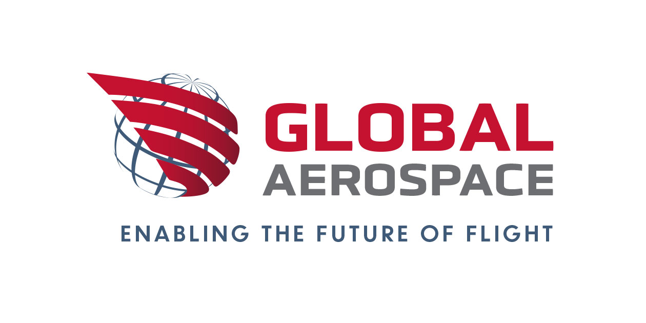
Take the Global Aerospace logo for example. The goal was, of course, to create something fresh and eye-catching. However, we had to be sure we didn’t lose any brand recognition in the process. And we also wanted the new logo to show a degree of deference and respect to the iconic image that it would replace.
Working closely with Global team members, we were able to do exactly that. We kept the “globe” portion of the logo and sense of energy and movement from the set of red lines, but gave these elements a more modern look and also updated the font. The result is a logo that is unmistakably “Global,” but with a contemporary aesthetic.
Bringing Clients and Prospects in for a Landing: An Enhanced Website
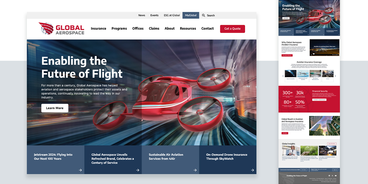
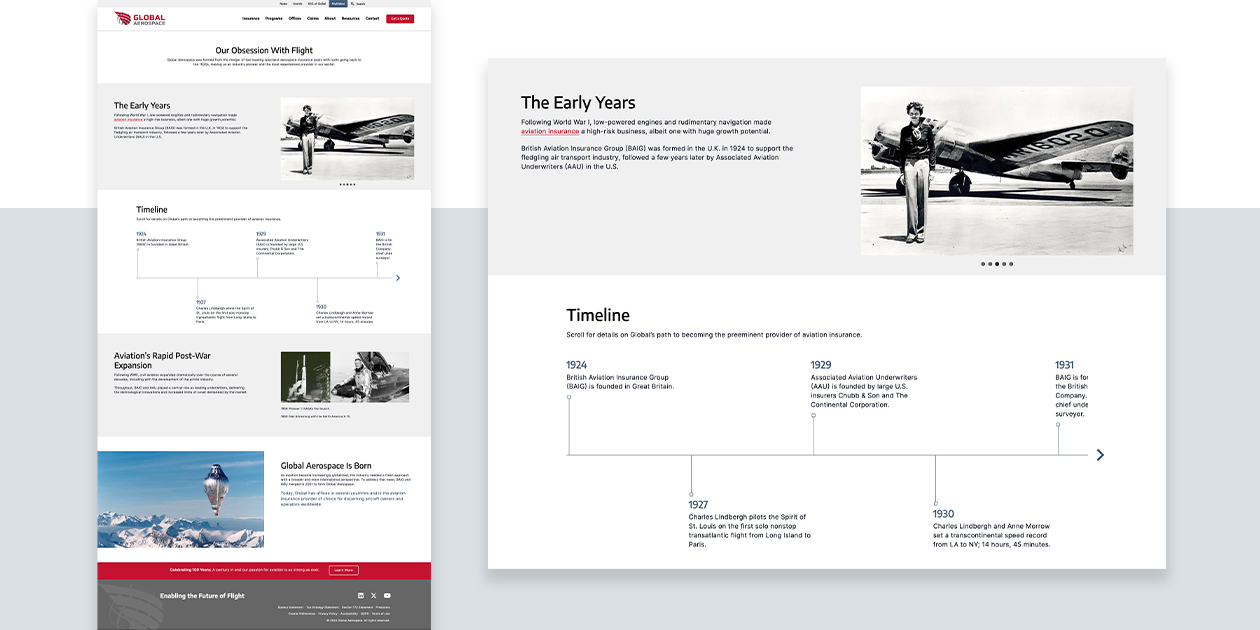
Global Aerospace’s website had served the company, its clients, and prospective clients well for many years. However, as is common in business, the folksy principle that “if it ain’t broke, don’t fix it” allowed the site to slowly lose some of its effectiveness.
Upon closer inspection and a detailed website audit, there were many areas for improvement, including:
- Revising outdated information
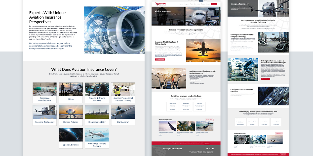
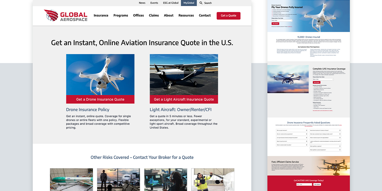
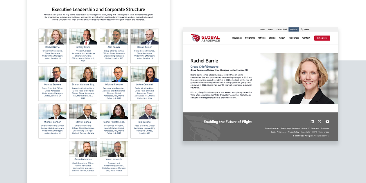
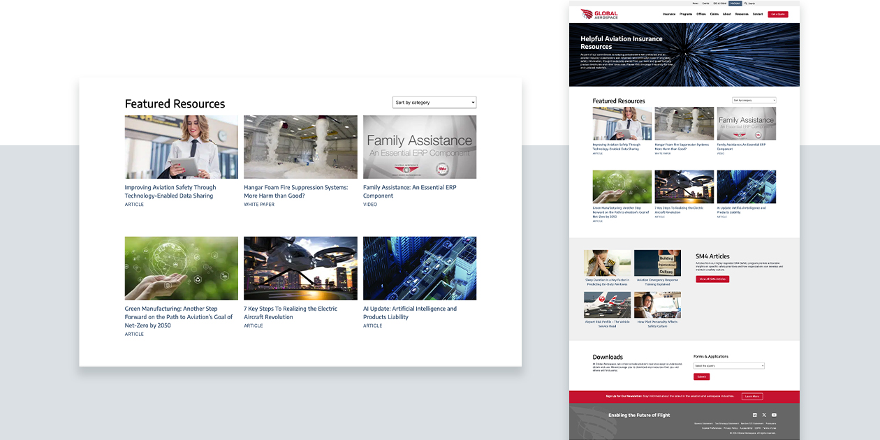
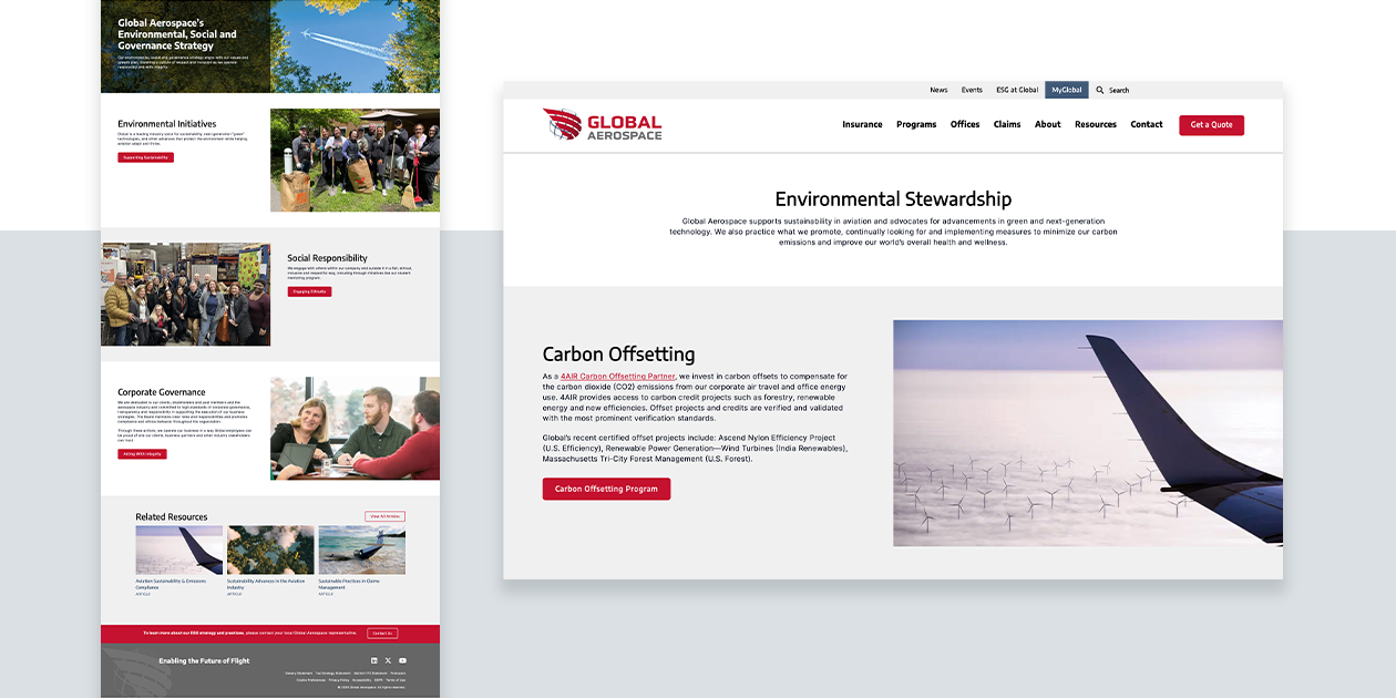
- Adding sections/pages for new offerings
- Updating verbiage based on a carefully considered SEO keyword strategy
- Refreshing the imagery
- Improving the navigation
- Introducing a more energetic tone
To make the process efficient for the company’s busy marketing team and other decision-makers, our design, user interface/user experience (UI/UX), and copywriting experts used existing resources and detailed notes from our strategy session to revise and develop material that Global could react to. We then incorporated feedback as we polished and finalized the site.
Like the company’s updated logo, the new website feels familiar and comfortable to past visitors but now offers more information, easier navigation, and overall, a better user experience.
Teamwork Is the Key to an Effective Brand Update
Our work with Global Aerospace on this brand update project and all its various facets highlighted something we’ve always known: teamwork is the key to success in this type of initiative.
Global’s subject matter experts gave generously of their time and expertise, our team was respectful of the team members’ many other work obligations and structured our outreach and interactions accordingly, and the resulting output met everyone’s high standards and expectations.
Today, a pioneer and leader in aviation and aerospace insurance has revised its look, reintroduced itself to its clients, and is making a very positive impression on people searching for insurance solutions and learning about the company for the first time. And from the visual appeal of the new Global Aerospace logo to the enhanced, more informative, and easier to use website, there is a great deal that is helping keep the company out in front of its competitors and leading its industry into the next 100 years.
In the first month since the launch, Global Aerospace has seen positive results on key website metrics:
- Online quote requests increased by 25%
- Average engagement time increased by 43%
- Organic search traffic increased by 37%
